

Hey there, Python enthusiasts! 🐍 Are you ready to level up your data visualization game with Pandas? Today, we’re diving into a topic that’s not just essential but also incredibly exciting: “Inbuilt Visualization with Pandas in Python.” Whether you’re an aspiring data scientist, analyst, or just passionate about Python, this blog post is tailor-made for you. Let’s explore the world of data visualization in Python, complete with examples that will light up your learning journey.
Why Data Visualization Matters?
Data visualization is the art of representing data in graphical and visual formats. It’s crucial because it helps us understand complex data, spot trends, and communicate findings effectively. In Python, Pandas comes equipped with inbuilt visualization tools that make creating stunning visualizations a breeze.
Getting Started: Importing Pandas and Data
Before we embark on our data visualization adventure, make sure you have Pandas and Matplotlib (a powerful Python data visualization library) installed. First let’s understand about matplotlib.
Matplotlib is a popular Python library for creating static, animated, or interactive visualizations in various formats, such as charts, plots, and graphs. It provides a high-level interface for drawing attractive and informative graphics, making it an invaluable tool for data visualization, scientific plotting, and more.
Key Features of Matplotlib:
- High-Quality Plots: Matplotlib produces publication-quality plots with precise control over every aspect of the plot’s appearance.
- Customization: It offers extensive customization options for colors, fonts, line styles, markers, and more, allowing you to create visually appealing visualizations.
- Support for Multiple Plot Types: Matplotlib supports a wide range of plot types, including line plots, bar charts, scatter plots, histograms, heatmaps, and more.
- Integration with Pandas: Matplotlib can seamlessly work with Pandas DataFrames, making it a powerful tool for visualizing data from your datasets.
- Multiple Backends: It supports various backends for rendering plots, including interactive GUI backends for creating dynamic and interactive visualizations.
Installation of Matplotlib:
To install Matplotlib, you can use the Python package manager, pip. Open your terminal or command prompt and run the following command:
pip install matplotlib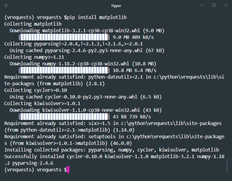
This command will download and install Matplotlib along with any required dependencies.
Basic Example: Creating a Simple Line Plot:
Let’s walk through a basic example to create a simple line plot using Matplotlib:
import matplotlib.pyplot as plt

# Sample data
x = [1, 2, 3, 4, 5]
y = [10, 12, 5, 8, 15]

# Create a line plot
plt.plot(x, y)

# Add labels and title
plt.xlabel('X-axis')
plt.ylabel('Y-axis')
plt.title('Simple Line Plot')

# Display the plot
plt.show()
In this example, we import Matplotlib as plt, create some sample data, create a line plot using plt.plot(), and then add labels and a title using plt.xlabel(), plt.ylabel(), and plt.title(). Finally, we use plt.show() to display the plot.
Advanced Customization:
Matplotlib allows for extensive customization of your plots. You can customize elements like colors, line styles, markers, legends, and more. Here’s a quick example of adding customization:
# Adding customization
plt.plot(x, y, color='blue', linestyle='--', marker='o', label='Data')
plt.xlabel('X-axis')
plt.ylabel('Y-axis')
plt.title('Customized Line Plot')
plt.legend(loc='upper right')
plt.grid(True)
plt.show()
In this example, we customize the line color, style, marker, add a legend, enable grid lines, and make other visual adjustments.
Matplotlib is a versatile library with extensive documentation and a large user community, making it a great choice for data visualization tasks in Python. Whether you’re creating simple line charts or complex scientific plots, Matplotlib provides the tools you need to visualize your data effectively.
Let’s start by importing Pandas and loading some sample data:
import pandas as pd

# Create a sample DataFrame
data = {'Month': ['Jan', 'Feb', 'Mar', 'Apr', 'May'],
        'Revenue': [5000, 6000, 7500, 8000, 9500]}

df = pd.DataFrame(data)
Visualizing Data with Pandas:
Here’s where the magic happens! Pandas provides a simple and intuitive way to visualize data directly from your DataFrame. Let’s start with some basic examples:
Example 1: Line Plot
# Create a line plot
df.plot(x='Month', y='Revenue', kind='line', title='Monthly Revenue')
Example 2: Bar Chart
# Create a bar chart
df.plot(x='Month', y='Revenue', kind='bar', title='Monthly Revenue')
Example 3: Pie Chart
# Create a pie chart
df.plot(x='Month', y='Revenue', kind='pie', autopct='%1.1f%%', labels=df['Month'], legend=False)
These are just the tip of the iceberg! Pandas offers various plot types, including scatter plots, histograms, and box plots, among others. You can customize colors, labels, and styles to match your preferences.
Advanced Data Visualization:
But wait, there’s more! Pandas integrates seamlessly with Matplotlib, allowing you to take your visualizations to the next level. You can access the Matplotlib axes and unleash your creativity:
import matplotlib.pyplot as plt

# Create a line plot with Matplotlib customization
ax = df.plot(x='Month', y='Revenue', kind='line', title='Monthly Revenue')
ax.set_xlabel('Months')
ax.set_ylabel('Revenue ($)')
plt.grid(True)
plt.show()

Conclusion:
Data visualization is an essential skill for anyone diving into data analysis or data science. With Pandas, you have a powerful tool at your fingertips that makes creating insightful visuals a breeze.
As you explore Pandas’ inbuilt visualization capabilities and combine them with Matplotlib’s flexibility, you’ll unlock the full potential of data visualization in Python.
Remember, the journey to becoming a Python pro is all about practice and curiosity. Keep experimenting, visualize your data, and watch your Python skills soar.
Stay tuned for more Python adventures, and until next time, happy coding! 🚀
Also, check out our other playlist Rasa Chatbot, Internet of things, Docker, Python Programming, MQTT, Tech News, ESP-IDF etc.
Become a member of our social family on youtube here.
Stay tuned and Happy Learning. ✌🏻😃
Happy tinkering! ❤️🔥


